Krita Color Notes: Use 5 Steps to Build Game Visuals That Feel Durable and Reassuring
Krita Color Notes: A 5-Step Workflow for Calm, Readable Game Art
The Core Problem
When people start painting game illustrations, the biggest issue is often not drawing skill. It is that colors get messier with every revision.
Typical problems look like this:
- The character looks great alone, but gets muddy in the scene
- UI text is hard to read, which increases player fatigue
- Day and night versions lose focus after color changes
- Every iteration feels like a full repaint with no reusable rules
Poor color decisions directly hurt readability, usability, and emotional clarity. On the other hand, once we build a stable process, our visuals become friendlier, more durable, and more beneficial to a wider audience.
The Solution
This note introduces a 5-step color workflow you can apply directly in Krita. The core idea is simple:
- Decide purpose first, not favorite colors first
- Lock value hierarchy first, then shape hue style
- Use low-cost checks to catch readability risks early
We organize color into three layers:
- Functional layer: information must be readable (buttons, warnings, interactions)
- Emotional layer: the mood must be clear (warm, tense, mysterious)
- Brand layer: the visual identity must stay recognizable
When all three layers are aligned, the image is not just pretty. It is easier to use.
Implementation Steps
Step 1: Build a Purpose-Driven Palette
Create a small canvas in Krita (for example, 1200x800) and prepare 12 swatches in four groups:
- Primary (3)
- Secondary (3)
- Accent (3)
- Neutral (3)
Recommended distribution:
- Primary 60%
- Secondary 30%
- Accent 10%
Do not rush into high saturation. Make sure your neutrals are stable first, then the whole system becomes more reliable.

Step 2: Validate Values in Grayscale First
Create a top-level “check layer” in Krita, set blend mode to Color, or switch to grayscale preview directly.
Confirm these three points first:
- Foreground subject and background are clearly separated
- Important interactive objects are instantly visible
- Text and icons maintain sufficient contrast
If grayscale already feels unclear, full color usually gets worse. Pass value checks first, then style.
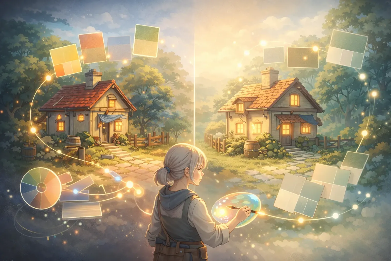
Step 3: Create Scenario Variants
Build at least three variants for the same scene:
- Day version (clear, open, action-oriented)
- Dusk version (transitional, story-driven)
- Night version (focused, cautious)
Do not recolor everything blindly. Adjust only three controls:
- Global color temperature (warm/cool)
- Background value (bright/dark)
- Accent saturation (high/low)
This gives you fast mood switching while keeping character and UI logic consistent.

Step 4: Add a Readability Safety Layer
To make visuals comfortable for more users, turn these checks into a fixed routine:
- Keep text/background contrast clearly legible
- Do not rely on red-green hue differences alone; add shape or icon support
- Ensure the focal point is still visible at small size (for example, 25% zoom)
This step matters because color is not only aesthetics. It is also information accessibility. If more people can understand it quickly, it is truly useful design.
Step 5: Export a Project Color Card
Package validated decisions into one project card:
- Swatches (Hex values)
- Usage contexts (character, environment, UI)
- Forbidden combinations (what not to pair)
Example format:
Primary-01: #3A6EA5 (main interaction areas)
Secondary-01: #E3B23C (secondary information)
Accent-01: #E15554 (warnings and high-priority states)
Neutral-01: #F4F4F4 (light base)
Neutral-02: #2B2B2B (dark base)
This card speeds up team collaboration and reduces repetitive recoloring costs.
Advanced Tips
Tip 1: Limit Hue Count for Better Cohesion
Too many hue families in one frame usually reduce focus. Keep the main subject area around 2 to 3 core hue families, then build depth through value and saturation.
Tip 2: Start with a Low-Saturation Draft
Finish a low-saturation draft first, then boost only key areas. This prevents an overly aggressive image from the beginning.
Tip 3: Separate HUD and Scene Design
In game visuals, HUD must be readable before it is stylish. Lock readability contrast first, then layer visual flavor on top.
Real Example
Case: Main Screen for a Cozy Farming Mini Game
The goal is a visual style that feels cute, relaxing, and comfortable for long sessions.
Execution:
- Use low-saturation green and off-white as a calm base.
- Use warm yellow for interactive buttons to guide action naturally.
- Keep warning states in small red areas to avoid global tension.
- Lower background value for night mode while preserving button brightness.
Results:
- Players find interactive zones faster
- Long sessions cause less visual fatigue
- The style remains consistent and scales well for future events
Common Issues
Q1: If I have a good eye for color, do I still need a workflow?
A: Yes. Taste is powerful, but workflow makes outcomes repeatable, especially in team production.
Q2: Should color work always start from hue?
A: Not necessarily. In production, starting from value is more stable because readability and focus are mainly value-driven.
Q3: Why does each revision feel like repainting from scratch?
A: Usually because there is no color card and no forbidden-pair rules. Once those are documented, maintenance becomes much easier.
Q4: How do I balance style and accessibility?
A: Treat accessibility as a design constraint, not an extra burden. The earlier you include it, the more inclusive and polished the result becomes.
Key Takeaways
You can compress this Krita color workflow into five lines:
- Define purpose before color preference
- Pass value checks before style decisions
- Build three scenario variants for the same scene
- Make readability checks a fixed routine
- Always export a project color card
Conclusion
The real value of color work is not making art look “impressive.” It is keeping visuals clear, comfortable, and usable across devices, contexts, and users.
By building this workflow in Krita, we gain more than nice images. We build a sustainable, collaborative method that can genuinely benefit more people.
If you only do one thing today, do this first: grayscale value checks plus a project color card. These two steps alone will stabilize quality immediately.
Related Resources:
-
Krita Docs: Color Concepts
- Core color concepts and color management in Krita
-
WCAG 2.1 Quick Reference
- International reference for readability and contrast
-
Adobe Color Wheel
- Build and test color combinations quickly
Tags: #Krita #ColorNotes #GameArt #2DIllustration #ColorDesign #Tutorial