Slay the Spire Visual Design Analysis: How Minimalist Aesthetics Built a Roguelike Classic
Slay the Spire Visual Design Analysis: How Minimalist Aesthetics Built a Roguelike Classic
Overview
Slay the Spire launched in 2017 and quickly became the benchmark for roguelike deck-building games. Developed by indie studio MegaCrit, it showcases innovative gameplay and exemplifies the “less is more” design philosophy. As the sequel approaches, let’s revisit its visual design brilliance.
Minimalist Yet Precise Art Style

Clear Visual Hierarchy
The interface prioritizes information delivery efficiency: card energy costs and effects are immediately clear, enemy intents and HP are well-displayed, and the map system uses clear iconography. No flashy effects distract—players grasp battlefield information in seconds.
Hand-Drawn Character Design
The game uses hand-drawn illustrations with each enemy having unique visual characteristics. From slime size differences to memorable boss designs, while not realistic, character personalities and threat levels are clearly communicated.
Card Visual Design Ingenuity

Color Coding System
Three character classes use different color schemes: Ironclad (red), Silent (green), Defect (blue). This coding helps players quickly identify card attributes.
Card Face Information Design
Each card’s layout is meticulously designed: top-left energy cost, center illustration, bottom effect description, border rarity. Upgraded cards show visual changes for easy identification.
UI Design User Experience
Combat UI perfectly supports fast-paced play: smooth card dragging, clear target highlighting, effect animations with sound, obvious end-turn prompts. With 200+ relics, each has a unique icon—players memorize common ones after a few runs.
Color Usage and Atmosphere
Visual Differentiation of Acts
Each act has unique visual themes:
Act 1: The Exordium - Gray-green palette, dark damp sewers Act 2: The City - Brown-tan palette, ruined streets Act 3: The Beyond - Blue-purple palette, eerie supernatural space
This progressive visual change reinforces the “climbing upward” experience.

Animation and Effects Design
Though minimalist, animations are thoughtful: red blade flashes for physical attacks, colored energy waves for skills, green dripping for poison. Status changes have clear visual feedback: red auras for strength, graying for weakness, cracked armor for vulnerability.
Design Philosophy Embodied
Function-First Principle
Visual design shows clear priorities: readability, consistency, efficiency, personality. Particularly suited to roguelikes: players need quick decisions, repeated playthroughs require efficient information gathering, long sessions without visual fatigue.
Accessibility Considerations
The game considers different player needs: colorblind mode, fast mode, adjustable text size.
Lessons for Indie Development
Slay the Spire proves: unified style matters more than advanced technology, clear information delivery beats flashy effects, player experience should be core.
MegaCrit chose 2D hand-drawn art to reduce costs, focused on card and UI design, let gameplay rather than graphics be the selling point. When players learn “red numbers mean damage,” gameplay flows smoothly.
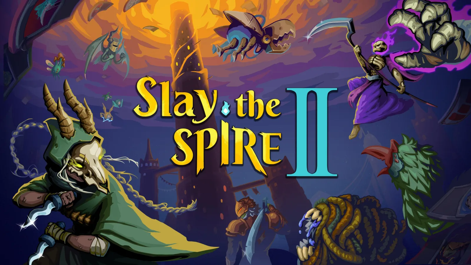
Anticipating the Sequel
Slay the Spire 2 may bring refined animations, new character designs, richer scenes, but should preserve clear information presentation, unified design language, and function-first philosophy.
Conclusion
Slay the Spire’s visual design isn’t the flashiest, but it might be the smartest. It proves good design doesn’t require massive budgets, minimalist style can create lasting impressions, and functionality and aesthetics can coexist.
For indie developers: Focus on core strengths, use consistent design language to establish visual identity, make every design decision serve player experience.
Related Resources: